

USABILITY EVALUATION FOR A MOOD TRACKER SITE
After 20+ years as the leading avenue for crowdsourced patient-to-patient medical, health, and wellness information, MedHelp.org needed to better understand how users interact with the website and access to their services. This project was designed to improve MedHelp.org site and mature their Mood Tracker service offering to better enable users to track their mood over time.
THE PROBLEM
I discovered several areas for improvement to increase the overall usability of the Mood Tracker on MedHelp.org based on the results of a prior usability test.
In this study, I used a between-subjects approach comparison test to understand if a button with a clear call-to-action will increase learnability over an inline text link for users adding data to their Mood Tracker. I recruited 50 participants who were all asked to complete the same task but were randomly assigned either the control interface with the existing inline text link or the experimental interface with a call-to-action button.
I found that replacing the inline text link with a call-to-action button yielded a statistically significant sevenfold increase in task completion rate. The change was not statistically significant in terms of time to complete the task nor participants perceived ease of use. I recommend that the MedHelp.org team change the inline text link to a call-to-action button for a low effort and high impact improvement while further research is done to consider how to further improve the overall Mood Tracker interface and the end-to-end process of adding data.

MY ROLE
I contribute on the four stages to carrying out usability testing which includes planning the test, carry out and moderate the test, analyze the results and prepare and present the report.
First I started for defining objectives before testing. I tried to make sure that the people who were taking part in the study were the ones who will be using the product in the wild and made the testing scenario as real as possible. Once the participants were testing I was acting as an observer and a moderator.
I was also able to determine whether the users succeeded or failed in carrying out the task at hand. I was focused on finding the hardest for them to do and which was the easiest, where they faced problems, etc. For the analysis, I collaborate with both quantitative and qualitative measures.

UNDERSTANDING THE USER
For this test, participants are at least 18 years old. The user can be either a male or female, and reside anywhere. They will understand their mood, which is their current state of mind and how it changes or can change at any particular time.
Whether positive or negative, the user will understand the different types of moods they can and will experience at some point in their life. The user will be familiar with entering information into forms and then reviewing it online or in web applications. The user will be familiar with and understand record-keeping and journaling. While it is not required for participants to have experience with mood journaling, we intend to use that as the main behavioral spectrum when defining representative user-profiles and evaluating our study’s results. The participant's level of familiarity with and their reasons for mood journaling will be gathered by warm-up questions at the start of the study.

Healthcare Design
Usability testing is a crucial step in healthcare or medical device design and development. It is important to be meticulous and careful when planning and conducting a usability test to ensure we're gathering the right data and interpreting it in the correct way. A single error can go a long way in ruining the study, and a single error in a deployed healthcare system could ruin somebody's health perception.
BREAKING DOWN THE PROCESS
This study aimed to answer the following research question: Will a button, with a clear call-to-action, increase learnability over an inline text link?
During each session, we collected the following quantitative data using Optimal Workshop’s first-click testing:
-
Success rate
-
Time-on-task
-
Ease of use
Method
User Profile
For this test, I recruited 50 participants through personal connections. All participants were over the age of 18. All participants digitally reviewed the informed consent and provided informed consent prior to participating in the study. Participants were randomly sorted into either the control or experimental group. As a pre-task question, all participants were asked if they were familiar with Mood Journaling.

Test Design
Methodology
I completed a comparison test with a between-subjects design using Optimal Workshop’s first-click testing product. All participants were asked to complete the same task but were randomly assigned either the control or experimental interface to use. The control interface is the current state of the Mood Tracker page which includes an inline link to add data, and the experimental interface replaces the inline link with a call-to-action button. For this study, we used a success rate as our primary evaluation measure to determine if there is a significant difference in the learnability of the two interfaces. We also gathered supporting data on time-on-task and ease of use to get a more comprehensive understanding of the user’s experience when completing the assigned task.
Session Outline and Timing
Sessions were unmoderated and remote using Optimal Workshop’s first-click testing product. After providing their informed consent, all participants were randomly assigned either the control or experimental screen and asked to complete the same task. The test took under 10 minutes to complete and can be found at https://meliador.optimalworkshop.com/chalkmark/n411lz6n.
Pre-test arrangements
-
Participant reviews the reason for the study and how their data will be used.
-
Participant provides informed consent to participate and confirms they are over the age of 18.
Pre-task questionnaire
-
“Are you familiar with mood journaling?” The participant selects yes or no.
Task
-
A participant is randomly assigned either the control or experimental screen and is asked to add a data point.
Task
Task Scenario: Add a data point
Imagine that you are at home getting ready for bed. You had a long day at work because you had a big presentation. A reminder to track your mood pops up on your phone. Use this interface to enter your mood for the day.
Desired Outcome
-
In the control interface, the desired outcome is that the participant selects the “Add a data point” inline link. In the experimental interface, the desired outcome is that the participant selects the “Add a data point” call-to-action button.
Evaluation Measures
For this study, the success rate is considered the primary measure to determine if there is a significant difference in the learnability of the inline link (control interface) and call-to-action button (experimental interface). Time-on-task and ease of use were also captured as supporting data.


Results
This study aimed to answer the following research question:
-
Will a button, with a clear call-to-action, increase learnability over an inline text link?
Success Rate
Control Interface
-
2 of 25 participants successfully completed the task.
Experimental Interface
-
14 of 25 participants successfully completed the task.
We conducted a N-1 two proportion test as we were comparing binary data of two groups with different participants in each group. The results of our N-1 two proportion test yielded a z-score of -3.64 that exceeds the lower bound of the z-critical at -1.96, thus we reject the null hypothesis that there is no difference between the learnability of the two interfaces related to successful completion. Using the Adjusted Wald Method, we are 95% confident that the confidence interval for successful completion lies between 0.207 and 0.459, with a margin of error of 0.126.

Adjusted Wald Confidence Interval for Success Rate

Confidence Interval for Success Rate

Time on task
Control Interface
-
The 2 successful participants averaged 16.41 seconds on the task, ranging from 13.37 to 19.44 seconds.
-
The overall average time-on-task was 16.71 seconds.
Experimental Interface
-
The 14 successful participants averaged 25.58 seconds, ranging from 3.29 to 34.04 seconds.
-
The overall average time-on-task was 16.72 seconds.
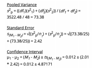
I conducted a 2-sample t-test as we were comparing continuous data of two groups with different participants in each group. The results of our 2-sample t-test yielded a one-tailed p-value of 0.498, which is less than the two-tailed p-value of 0.995, thus we fail to reject the null hypothesis that there is no difference between the learnability of the two interfaces related to time-on-task. I am 95% confident that the difference between control and experimental group means lies between -4.860 and 4.884.
2 Sample T - Test for Time on Task

Confidence Interval for Time-on-Task
Ease of use
Control Interface
When asked to what extent they agreed with the statement “I found this task easy to complete”:
-
Of the 2 participants who successfully completed the task, 1 participant was neutral about the statement while the other one moderately disagreed with the statement.
-
Most participants (13 total) disagreed with the statement, with 10 who moderately disagreed and 3 who strongly disagreed.
-
7 participants were neutral about the statement.
Experimental Interface
When asked to what extent they agreed with the statement “I found this task easy to complete”:
-
2 of 25 participants did not provide a response.
-
Of the 14 participants who successfully completed the task,
-
2 participants did not provide a response.
-
2 participants strongly disagreed with the statement.
-
3 participants moderately agreed with the statement.
-
2 participants strongly agreed with the statement.
-
5 participants were neutral about the statement.
-
-
8 participants disagreed with the statement, with 2 who moderately disagreed and 6 who strongly disagreed.
-
8 participants agreed with the statement, with 5 who moderately agreed and 3 who strongly agreed.
-
7 participants were neutral about the statement.
I conducted a 2-sample t-test as we were comparing continuous data of two groups with different participants in each group. The results of our 2-sample t-test yielded a one-tailed p-value of .277, which is less than the two-tailed p-value of 0.553, thus we fail to reject the null hypothesis that there is no difference between the learnability of the two interfaces related to ease of use. I am 95% confident that the difference between control and experimental group means lies between -.811 and 1.491
Interface Concept Screens


LESSONS LEARNED
In an earlier usability test, we determined that users do not have a clear understanding of where to click to add data to their Mood Trackers. When asked to add a mood to their Mood Tracker, participants of the earlier study spent around a quarter of their time trying to figure out where to go to add data.
If users are unable to add data to their Mood Tracker, they will be unable to use any of the functionality provided by the Mood Tracker. Adding data is expected to be the most frequent action that users will complete; the MedHelp.org intention is for users to add data daily, if not multiple times a day. If users are unable to find how to add data to their Mood Tracker, the Mood Tracker will not meet their needs and they will choose a different platform to use. Additionally, the quality of data that users add and the frequency with which they add data can be negatively impacted if users find the process of adding data cumbersome or unusable.
Additional research should be done to consider how to further improve the overall Mood Tracker interface and the end-to-end process of adding data. Our study showed that changing the inline text link to a button is not statistically significant in terms of the time it takes for users to identify how to add data nor their perceived ease of use for the task. Users may be overwhelmed by the amount of content and clutter on the Mood Tracker interface, which may be impacting their time-on-task and perceived ease of use.