

INFORMATION ARCHITECTURE
This project was centered around the “Campbell County, TN Public Schools” Website which is a school district that serves Campbell County, Tennessee, United States.
THE PROBLEM
School websites established several years ago may have grown very large. As a result, they may be confusing to users, difficult to manage and may not accurately reflect current school priorities.
The original designer from Campbell County, TN Public Schools tried to provide useful information on each page, however, the menu and submenus have not been organized properly based on their categories and it makes it complicated to navigate.
Unfortunately, the repetition of the frequent titles in order to emphasize their importance has made it difficult for the user to follow the path. In addition, irresponsive design framework, isolated pages, and mess of links have reduced its conversions and user-friendliness.
Another UX fail of this website is its outdated design. The inappropriate use of typefaces and white spaces caused difficulty for the visitors to read. That is why the redesign would be a huge success from a UX perspective which can enhance experience and smoothness.

MY ROLE
After visiting this website and spend time looking for information the school provides, I came up empty and I was not able to find anything useful. Therefore, in order to improve the site, I was in charge of conducting customer research, update and review the content, apply card sorting for content classification and building a user-friendly hierarchy.
The objective of this project was to consider the specifics of our target audience needs in order to put user satisfaction as a priority. As well as to provide greater insights on organizing and labeling information.
As the user researcher of the group, I was in charge of gathering data about the school and user needs and behaviors, through desk and field research. My first step was to understand the site’s content and the users’ vocabulary. This helped me to choose what items could be included, the terminology to use on the research methods and the best ways of organizing and labeling content.
The methods that I use for generative and evaluative user research was card sorting, tree testing, and testing information architecture with low-fidelity prototypes. I was also in charge of evaluating how users determine whether they can find things where we’ve put them.

UNDERSTANDING THE USER
The personas with defined needs and pain points were teachers, students, and parents. This helped us to evaluate the website based on specific user needs. The main goal was to ensure the new redesign would address the needs of the personas and provide a more seamless user experience.
PERSONAS

Scenario 1:
Searching for the spring break time Suzanne needs to know when the spring break will start and end so that she can plan a short family vacation in April. Being a full-time accountant, Suzanne does not have time to visit the school during office hours. Therefore, during her lunchtime, she conveniently opens the Campbell County TN Public Schools website on her cellphone to search for “spring break”. Suzanne clicks on the “About Us” on the top menu, and then clicks on the “Calendar & Events.” Then she searches “spring break” and reviews the available information. She notes the dates in her schedule.
Scenario 2:
Registering for a volunteering job Suzanne and her friend, Nancy, are interested to teach computer skills to elementary students on weekends, therefore, they need to find out the requirements. Suzanne opens the Campbell County TN Public Schools website. She clicks on the “About Us” and then clicks on the “Policies and Forms” to search for the volunteer requirements in the school. After reviewing, she sends the related URL to Nancy.
USER SCENARIO
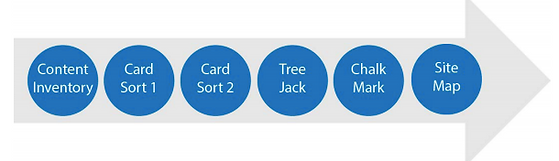
BREAKING DOWN THE PROCESS
To understand users’ pain points, we conducted three types of testing to the information architecture:
-
Content Inventory
-
Card Sorts
-
Task-based test
CONTENT INVENTORY
The Content Inventory is based on what already exists on the current website. There were a total of 87 content items:
-
Seven Level 1 category
-
Forty-one Level 2 categories
-
Thirty-nine Level 3 categories

CARD SORT
From the initial content inventory, areas of opportunity were identified, and two rounds of card sorts were conducted which both were hybrid. The participants were recruited by family, friends,and colleagues:
First Round


Questionnaire
We added one pre-survey question and three post-survey questions to the card sort in order to get more qualitative insights. This enabled us to segment the results based on the participants’ answers in our analysis. We have also requested the participants to provide us with their email address in order to keep track of the person that took the test.
• Pre-study questions: Based on this question, we wanted to know if the participants were the potential users for the website or not.
-
Please select at least one option:
-
I am a student
-
I am a parent
-
I am a teacher
-
Other
• Post-study questions: In order to avoid too much simplicity or difficulty in later steps, the participants were asked to rate the difficulty of the card sort. Their responses to the second and third questions helped us to understand their thoughts about the cards and conduct a better card sort for the next round.
-
How easy or difficult did you find this card sort?
-
Which cards, if any, were most difficult to sort? Why do you think that is?
-
Which cards, if any, were difficult to understand?
Results
• Based on the post-study questions, the “Lunch Menu” and “School Nutrition” were difficult to place in a specific category.
• The participants were confused by the meaning of “Instruction”, “Star Portal“, “Related Organizations”, and “Talent Research”.
• Most of the participants left the exact items in the same category as the original website, however, new items were also created.
Changes
• In the first round, some participants were uncomfortable to give us their email address. Thus, we decided to do not ask them for the email address in the second round.
• After more research, we found that “Talent Search” and “Start Student” should go under “Star Portal”.
• Since the analysis reflected the confusion of the participants, we felt the need to explain further the objective of the cards. We focused on explaining the confusing points that disorient the participants in the first round. In order to make it more clear and easy to place information in the right category, we rename our cards. For example:
-
Central Office Clerical Person: Central Office (Contact Info)
-
Circumstances and Assessments: Circumstances and Assessments Department
-
Coordinated School Health: Coordinated School Health Department
-
Donation Program (wall): Donation Program
-
Federal programs: Federal programs (support students in high poverty schools)
-
Instruction: Instruction (Test resources)
-
Links of interest: Links of interest for parents and students
-
Policies and forms: Policies Schools Nutrition Information: Schools Nutrition Department
Second Round


For the second round, we used the paid version of the Optimal Workshop. Therefore, we did not have the previous limitation for this round. We focused on 28 cards, 6 categories: “Our Schools”, “About Us”, “Parent and students”, “Departments” and “I’m not sure” to find participant’s confusion. Also, we recruited different participants in order to achieve a better perspective. 30 of 39 participants who were mainly from the united states, completed the study. 96.7% of them were students, 3.3% were teachers, and 6.7% were parents. On average, it took each participant 04m 22s to complete the study.
Questionnaire
Because the results of the questionnaire in the first round of card sorting was very helpful to get some qualitative insights, we decided to use them again in the second round without any changes.
Results
• “Coordinated School Health”, “School Nutrition”, and “Circumstance and Assessment” cards have been categorized correctly after we changed their name in the second round.
• Some of the participants did not know the following cards belongs to which category: “Related Organization”, “Star Portal”, “Lunch Menu”.
• Although we explained about the “Federal program” and “Instruction” cards, some of the participants were still confused about them.
Changes
•We found that we need to include a brief explanation of the website to the welcome message. This was aimed especially for the remote participants. The results show that they did not have a clear understanding of the website’s goal. Therefore, adding this explanation would prevent potential confusion and will help the participants to understand the meaning of the cards and their categories better.
• After further research, we found that we need to add one more item, “Attendance“, under the department category. We already had identified it in the content inventory, but we did not know that it is a department. Unfortunately, it happened because the current website is confusing and it is difficult for users to understand its details.
• We changed “Employee Opportunities” to “Careers” in order to better understanding.
• For the next step, updating the sitemap and conducting the Tree Jack, we added the related pages to each subcategory. For example, we put “Involvement Information”, “Involvement Form”, and “Evaluation and Confirmation” pages under the “Parent Involvement” subcategory.
TREE JACK
We conducted one round of TreeJack by Optimal Workshop as task-based testing. 18 of 27 participants completed our study and it took them a median time of 04m 46s to complete the study.

Questionnarie
In order to get more qualitative insights, we added four post-survey questions to the three jack:
1. What, if anything, would you change about the menu you just tested? Please explain your answer.
2. Which, if any, of the tasks in the test, were difficult to complete? Please explain your answer.
3. Is the menu you just tested BETTER, WORSE, or ABOUT THE SAME as other web sites you have visited? Please explain your answer.
4. Overall, how difficult or easy was it to locate what you needed in this menu?
Based on these questions, we wanted to be sure that completing this tree jack is not too simple or too difficult for the participants. They were asked to compare this with other web sites which they have visited and give us their suggestions. The following is an overview of the 8 tree jack tasks used for task-based testing: Which indicates that 85% ended up at a “correct” answer and 64% of answers were chosen without backtracking.

Tasks
1. You are interested to know more about the Campbell County School goals, where would you click to get this information?
2. You want to know what type of meals the schools offer, where would you click to get this information?
3. As a parent, you want to get involved in your child’s school, where would you click to do this?
4. In order to plan ahead for any vacation during the school year, you want to be informed about activities, where would you click to find out more about Spring Break?
5. Your child is attending one of the Campbell County schools, and you want information about bus schedules and routes, where would you click to find this information?
6. You are interested in talking to the director of the Campbell County Schools, where would you click to find his/her phone number?
7. You want to work for Campbell Public Schools, where would you go to see open positions?
8. You want to enroll your child into “Jellico Elementary School”, where would you click to find out if “Jellico” is in Campbell County?
These tasks were selected in order to share relevant, interesting and engaging information to all parents and students. The main objective is to receive feedback to improve the school website and all of the communication efforts to keep current parents happy and enthused as it is to attract new students and their parents.
Results
Based on the Treejack scores three aspects of participant responses are important: success, directness, and speed and each task give an overall score. The Success score refers to the percentage of participants who selected the correct answer. A success score of around 80% or more is considered a good score for a task. However, it can be direct or indirect. Direct will indicate that the participant went directly to the correct answer and Indirect indicates the participants got the answer correct but moved back up through the tree at least once before doing so.
-
Task 1: Success 94% Direct 44% Indirect 50%
-
Task 2: Success 78% Direct 28% Indirect 50%
-
Task 3: Success 89% Direct 89 % Indirect 0
-
Task 4: Success 72% Direct 28% Indirect 44%
-
Task 5: Success 78% Direct 33% Indirect 44%
-
Task 6: Success 94% Direct 83% Indirect 11%
-
Task 7: Success 78% Direct 44% Indirect 33%
-
Task 8: Success 100% Direct 83% Indirect 17%


Based on these numbers we can say that participants had more confidence when going to and selecting an answer for task 3, 6. 8. However, for tasks 1 and, 2 even though participants still selected the proper answer we can see that hesitation was involved in their decision.
We also found new opportunities. Based on the results we noticed that tasks 2, 4, 5, and 7 did not reach an appropriate success rate. In order to better understand these scores and what participants attempt during the test, our analysis we focused on the Pietree in Treejack.
This analysis shows which way our participants went at each junction in our content hierarchy and what they all selected as their final answers. Focusing on this type of analysis helped us to ensure our Information Architecture and content labels are suitable for the users before we move on to wireframing.
Based on these results for newly constructed sitemap most of them were positive. Task #8 reached a high score with a direct response of 83% because participants went on the right path.
Task 8

Task 2

Task 4

CHALK MARK
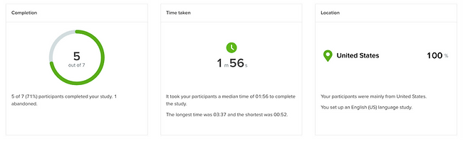
We conduct one round of Chalk Mark to have participants walk through tasks and determine if wireframes assist users in completing tasks. 5 of 7 participants who were mainly from the united states, completed the study. 40% of them were students, 20% were teachers, and 40% have chosen “other”.
Tasks
Participants were asked to complete 5 tasks:
1. Find the date of graduation on the educational calendar.
2. Check the events of a special day on the next month.
3. Where do you look for to read about a special policy?
4. Where do you click to find the test resource of your child’s exam?
5. To find the office phone number, where would you click?

Results
• Task 5 reached a high score with 80% success because participants went on the right path.
• The result show task 2 and task 3 were %40 successful.
• Participants were able to find the right path on tasks 3 and 4 with %60 of success

SITEMAP

After analyzing the data it helped us understand if the information was located properly and whether the content was up-to-date. It also allowed us to find out how users expect to see information grouped in the website and organize submenus. We updated the sitemap twice based on the results of each card sort and participant’s feedback and one more after the tree jack results.
Sitemap First Version

Sitemap Final Version
Based on the results of the test we changed “Parents & Students”, “departments” and “about us” categories. We found out that “Calendar and events”, “ Policies and forms” and “Board of Education” should go under “about us”.”School Nutrition: Lunch Menu” should go under Departments.

WIRE-FRAMES
Desktop Wireframes: two tasks


MOBILE WIREFRAMES


LESSONS LEARNED
It was an interesting project. Once I determined the goals of the website I decided what kind of information should be included and modified in the inventory.
However, the process was very helpful because It made me understand the website quite well and helped me identify patterns in content structure. Starting for the card sorting process, it was interesting learning participant’s feedback as they have the ability to choose names for the groups they’ve put together, forming the potential categories and subcategories of the website.
I also learned that it is necessary to be clear when describing the project’s objective because some participants won’t necessarily know what the content is about or understand any nuances between cards. Therefore when creating our card sorts I needed to keep this in mind. As a result, this helped me understand where users got lost or confused and made decisions to create an easier, more logical and user-centric way of navigating the site.